


-

REYUP RECONDITIONING CENTER
Project Overview
The Reyup Reconditioning Center is the only reconditioning center in the country that helps the body recover sustainably and return to daily life through solving fundamental problems in the body. We have developed a brand identity that focuses on creating a true reconditioning unique to Reyup, moving away from the medical and fitness-oriented stereotypes that are already prevalent in the market and finding the meaning of life through freedom of the body.

Core value
In this way, the REYUP Reconditioning Center is for everyone who complains of physical discomfort in their daily lives, regardless of whether they are elite athletes or the general person with the help of experts, we recognize body problems, find links to potential strength, and create optimal physical condition. Through the Core Value, REYUP emphasizes its identity and expertise as a reconditioning brand.
brand naming / slogan
REYUP’s Brand Naming and Slogan were developed to be easily and intuitively conveyed to all consumers who encounter
the brand. Concisely expresses the benefits of reconditioning, which goes beyond general rehabilitation and creates optimal physical condition in everyday life. Contributes to promoting REYUP’s brand identity through repeated exposure to customer contact points and media.
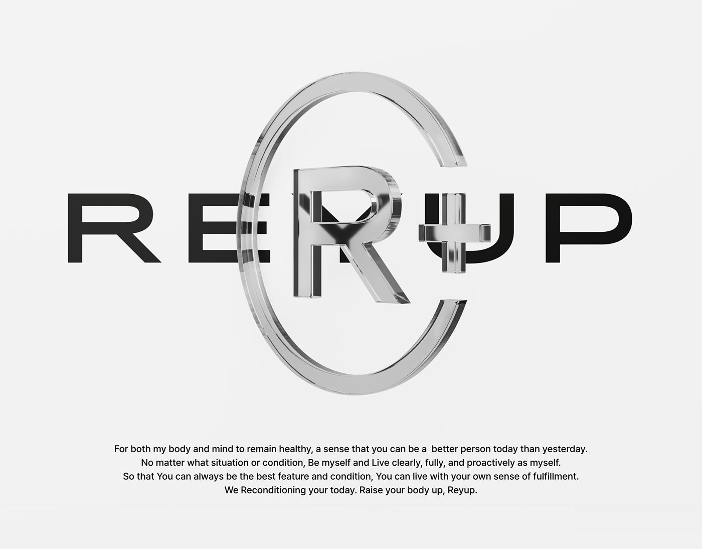
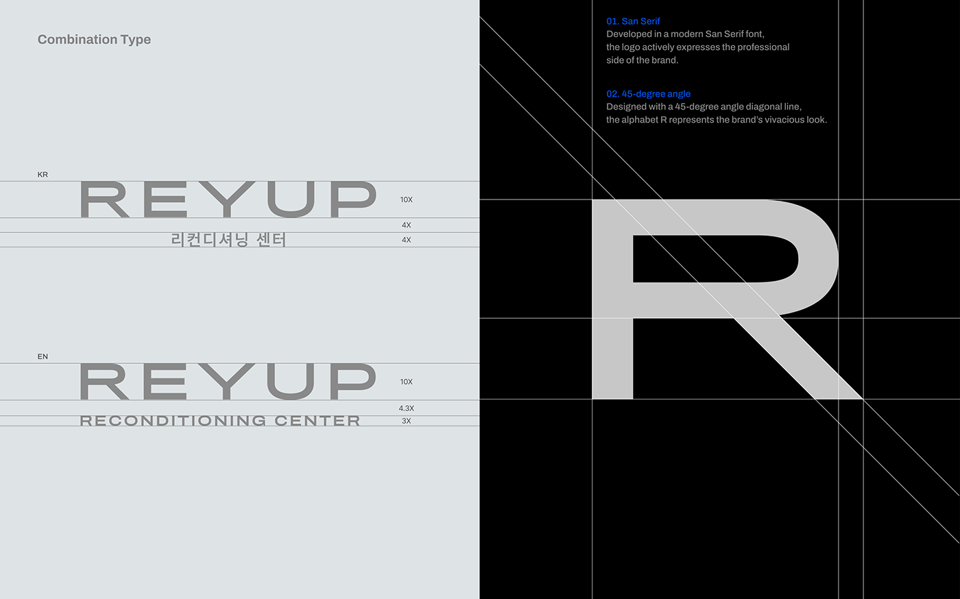
brand LOGO
The logo of the Reyup Reconditioning Center was developed in a simple Gothic font to convey the credibility of the brand's professional side and heartfelt attitude. The diagonal lines shown in the alphabets R and Y are designed at a 45-degree angle to actively reflect brand essence by expressing the most stable yet dynamic and energetic image of the Reyup brand.


certification mark
Reyup's 'certification mark' is a more direct representation of the brand's expertise in offline environments. Certification mark is used as a certification mark to symbolize brand expertise and systematic education. 'Plus Mark' is used as a mark for authentication, and 'Check Mark' is used as a mark to indicate the completion of the Reconditioning Master Program.

typeface
The brand-only font uses a Semi Expanded type font that can be combined with a wide logo type.
In the body type, including Korean and English, a neat and simple image is expressed using a font that can be
harmonized with logo and title typeface.


color
To give a professional and strong image, we used a clean white color and a blue color that symbolizes trust. We developed a color system to make the brand's image look rich by using blue and gray tones as secondary colors, which are mainly black and white and suitable for expressing the professional aspect of the brand.

graphic system
Reyup's graphics system is made with the motifs of FIELD, RECONDITIONING, and UP. The graphics, produced in the form of basic figures, are simple, but can implicitly represent the value that the brand is trying to convey. Graphics applicable to different environments, offline and online media, are represented in all of Reyup's visuals.


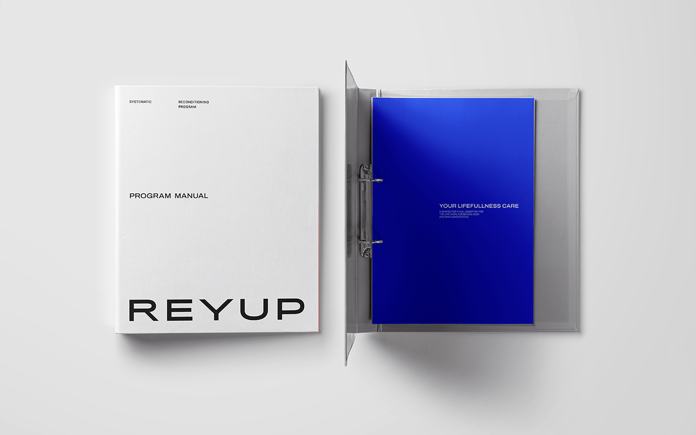
applications
Reyup's application is designed with a focus on expressing a simple and reliable mood to customers. The brand's unique professional features, expressed in a black & white color system and a simple typography system, maximize the originality of Reyup customers will experience.


Reyup (2023)
Project Owner. Reyup Reconditioning Center
Executive Director. Changho Lee
Creative Director. Jiwan Kim
Executive Director. Changho Lee
Creative Director. Jiwan Kim
BX Design. Jayong Jung, Jiyeon Woo
Concept. Yoseb Kang, Yongwoo Jeon, Jooli Song
Motion Designer. Hyeonju Bae, Taeeun Um


